Your graphics add a nice touch to my presentations and I recently used them for one of my all-hands meetings. Your toolbox adds professionalism to my slides. Instead of using standard clipart.
Claude Jones, Director of Engineer, @Walmartlabs, USA
Your graphics add a nice touch to my presentations and I recently used them for one of my all-hands meetings. Your toolbox adds professionalism to my slides. Instead of using standard clipart.
Claude Jones, Director of Engineer, @Walmartlabs, USA
I needed a fresh look at some of my slides. I've tried to find a way to create a paintbrush effect, to underline, accentuate, add some color and the handwritten markers were just the things. Very easy to use, easy to size, change the color. It was an affordable, perfect solution and I'm happy to recommend it.
Anonymous, US
The crisp, clean look of the graphics, and the fact that it allowed me to easily edit and change the colors to match the template was my main reason for purchasing them.
Brandie Jenkins, E-learning Developer, USA
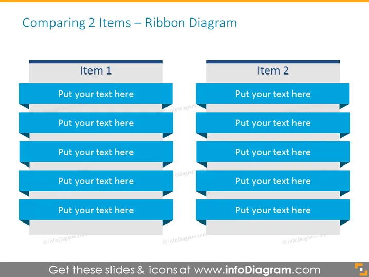
This slide is meant for comparing two items or concepts and uses a ribbon-style diagram to present the information. "Item 1" and "Item 2" are positioned as headings for each column, suggesting a comparison between them. Below each heading, there are five blue ribbon banners where explanatory text can be added. These ribbons offer a structured way to present different aspects or features of the two items, promoting an easy-to-follow visual comparison.
The slide employs a clear, professional design with an emphasis on contrasting colors that make the content pop. Its structured layout provides an uncomplicated way for the audience to assimilate the compared information.


