Your graphics add a nice touch to my presentations and I recently used them for one of my all-hands meetings. Your toolbox adds professionalism to my slides. Instead of using standard clipart.
Claude Jones, Director of Engineer, @Walmartlabs, USA
Your graphics add a nice touch to my presentations and I recently used them for one of my all-hands meetings. Your toolbox adds professionalism to my slides. Instead of using standard clipart.
Claude Jones, Director of Engineer, @Walmartlabs, USA
I needed a fresh look at some of my slides. I've tried to find a way to create a paintbrush effect, to underline, accentuate, add some color and the handwritten markers were just the things. Very easy to use, easy to size, change the color. It was an affordable, perfect solution and I'm happy to recommend it.
Anonymous, US
The crisp, clean look of the graphics, and the fact that it allowed me to easily edit and change the colors to match the template was my main reason for purchasing them.
Brandie Jenkins, E-learning Developer, USA
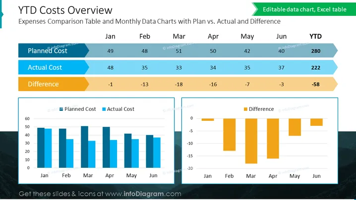
The slide showcases a financial comparison titled "YTD Costs Overview," indicating a year-to-date analysis of expenses with emphasis on the comparison between planned and actual costs, and the respective differences. There are columns for each month from January to June, followed by a YTD column. For each month, the Planned Cost, Actual Cost, and the Difference between them are listed numerically. The difference is calculated by subtracting the actual cost from the planned cost. This provides viewers with a clear monthly and cumulative financial performance assessment over half the year.
The slide is professionally designed with a clean and informative layout, utilizing color-coding to delineate different types of financial data for ease of understanding.


