Your graphics add a nice touch to my presentations and I recently used them for one of my all-hands meetings. Your toolbox adds professionalism to my slides. Instead of using standard clipart.
Claude Jones, Director of Engineer, @Walmartlabs, USA
Your graphics add a nice touch to my presentations and I recently used them for one of my all-hands meetings. Your toolbox adds professionalism to my slides. Instead of using standard clipart.
Claude Jones, Director of Engineer, @Walmartlabs, USA
I needed a fresh look at some of my slides. I've tried to find a way to create a paintbrush effect, to underline, accentuate, add some color and the handwritten markers were just the things. Very easy to use, easy to size, change the color. It was an affordable, perfect solution and I'm happy to recommend it.
Anonymous, US
The crisp, clean look of the graphics, and the fact that it allowed me to easily edit and change the colors to match the template was my main reason for purchasing them.
Brandie Jenkins, E-learning Developer, USA
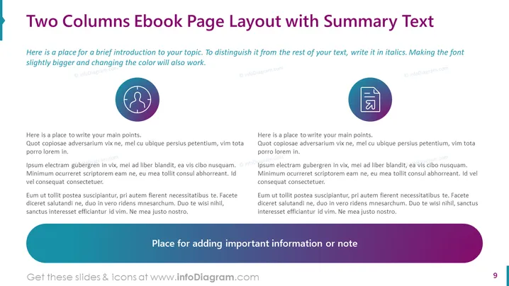
Slide Content: The slide is an example of a two-column layout that can be used to present information efficiently and effectively in an ebook. On the top, there is a brief introduction, suggesting that italicizing text and changing font color helps distinguish important details. Below, each column contains placeholder text indicating where the main points should be written, suggesting a balanced approach to content distribution. The right-hand side imitates the left in structure but visually demonstrates how easy it is to organize similar content. A footer area is designated for adding additional important notes or summaries.
Graphical Look:
The overall look of the slide is modern and professional with a clean, organized layout. The consistent use of purple tones provides a cohesive design aesthetic.
Use Cases:


