Your graphics add a nice touch to my presentations and I recently used them for one of my all-hands meetings. Your toolbox adds professionalism to my slides. Instead of using standard clipart.
Claude Jones, Director of Engineer, @Walmartlabs, USA
Your graphics add a nice touch to my presentations and I recently used them for one of my all-hands meetings. Your toolbox adds professionalism to my slides. Instead of using standard clipart.
Claude Jones, Director of Engineer, @Walmartlabs, USA
I needed a fresh look at some of my slides. I've tried to find a way to create a paintbrush effect, to underline, accentuate, add some color and the handwritten markers were just the things. Very easy to use, easy to size, change the color. It was an affordable, perfect solution and I'm happy to recommend it.
Anonymous, US
The crisp, clean look of the graphics, and the fact that it allowed me to easily edit and change the colors to match the template was my main reason for purchasing them.
Brandie Jenkins, E-learning Developer, USA
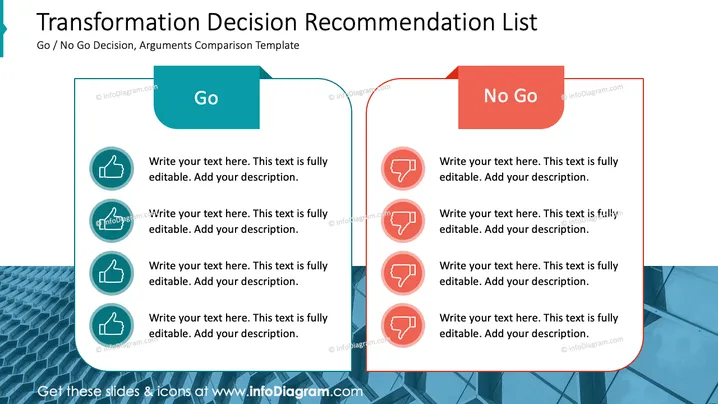
The slide is structured as a comparison list to weigh the pros and cons of a "Go / No Go Decision" for a proposed transformation or change. The "Go" section on the left lists positive arguments, each accompanied by a thumbs-up symbol, indicating approval or consent. These can be detailed by the presenter to build a case for moving forward with the decision. Conversely, the "No Go" section on the right, denoted by thumbs-down symbols, is used for documenting reasons against the decision.
The overall look of the slide is crisp and professional, with a strong visual metaphor of balance and comparison through the color-coordinated design and iconography.


