Your graphics add a nice touch to my presentations and I recently used them for one of my all-hands meetings. Your toolbox adds professionalism to my slides. Instead of using standard clipart.
Claude Jones, Director of Engineer, @Walmartlabs, USA
Your graphics add a nice touch to my presentations and I recently used them for one of my all-hands meetings. Your toolbox adds professionalism to my slides. Instead of using standard clipart.
Claude Jones, Director of Engineer, @Walmartlabs, USA
I needed a fresh look at some of my slides. I've tried to find a way to create a paintbrush effect, to underline, accentuate, add some color and the handwritten markers were just the things. Very easy to use, easy to size, change the color. It was an affordable, perfect solution and I'm happy to recommend it.
Anonymous, US
The crisp, clean look of the graphics, and the fact that it allowed me to easily edit and change the colors to match the template was my main reason for purchasing them.
Brandie Jenkins, E-learning Developer, USA
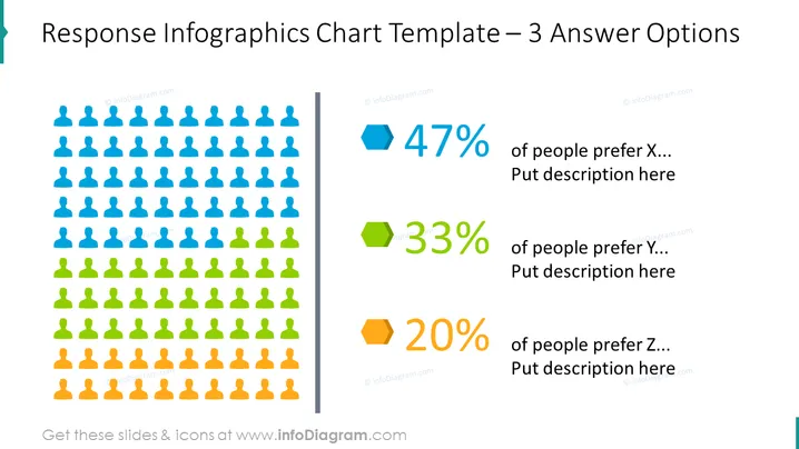
This PowerPoint slide showcases a graphical representation of survey results or preferences with three different categories labeled as X, Y, and Z. It shows that 47% of participants prefer option X, followed by 33% for option Y, and 20% for option Z. Each percentage is indicated through a different color and corresponding icon, which could potentially denote the number of people showing preference for that option. The slide seems to serve the purpose of visually comparing the popularity or selection rate of three distinct choices.
The slide has a modern, clean design with its use of flat icons and bold color-coding for visual segmentation. The use of placeholders suggests that the slide is customizable for different data sets and descriptions.


