Your graphics add a nice touch to my presentations and I recently used them for one of my all-hands meetings. Your toolbox adds professionalism to my slides. Instead of using standard clipart.
Claude Jones, Director of Engineer, @Walmartlabs, USA
Your graphics add a nice touch to my presentations and I recently used them for one of my all-hands meetings. Your toolbox adds professionalism to my slides. Instead of using standard clipart.
Claude Jones, Director of Engineer, @Walmartlabs, USA
I needed a fresh look at some of my slides. I've tried to find a way to create a paintbrush effect, to underline, accentuate, add some color and the handwritten markers were just the things. Very easy to use, easy to size, change the color. It was an affordable, perfect solution and I'm happy to recommend it.
Anonymous, US
The crisp, clean look of the graphics, and the fact that it allowed me to easily edit and change the colors to match the template was my main reason for purchasing them.
Brandie Jenkins, E-learning Developer, USA
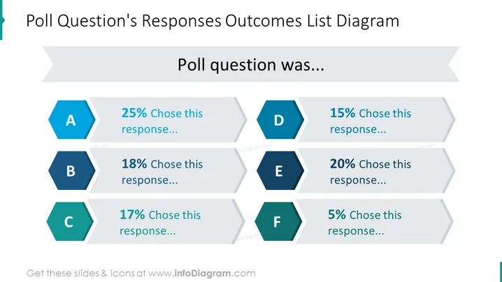
The slide presents the results of a poll question with six response options, labeled A to F. Each response option has an associated percentage, indicating the proportion of participants who selected that option. Response A was chosen by 25%, suggesting it was the most popular. Response B at 18% and Response C at 17% were moderately selected. Response D had a slightly lower preference at 15%, whereas Response E was favored by 20% of the respondents. The least preferred is Response F, with only 5% selecting it. This visual arrangement effectively conveys the distribution of poll answers.
The slide utilizes a clean and modern design with contrasting colors and geometric shapes to draw focus to the key information. The use of hexagons for responses and the flow of the percentage bars creates a dynamic yet organized appearance.


