Your graphics add a nice touch to my presentations and I recently used them for one of my all-hands meetings. Your toolbox adds professionalism to my slides. Instead of using standard clipart.
Claude Jones, Director of Engineer, @Walmartlabs, USA
Your graphics add a nice touch to my presentations and I recently used them for one of my all-hands meetings. Your toolbox adds professionalism to my slides. Instead of using standard clipart.
Claude Jones, Director of Engineer, @Walmartlabs, USA
I needed a fresh look at some of my slides. I've tried to find a way to create a paintbrush effect, to underline, accentuate, add some color and the handwritten markers were just the things. Very easy to use, easy to size, change the color. It was an affordable, perfect solution and I'm happy to recommend it.
Anonymous, US
The crisp, clean look of the graphics, and the fact that it allowed me to easily edit and change the colors to match the template was my main reason for purchasing them.
Brandie Jenkins, E-learning Developer, USA
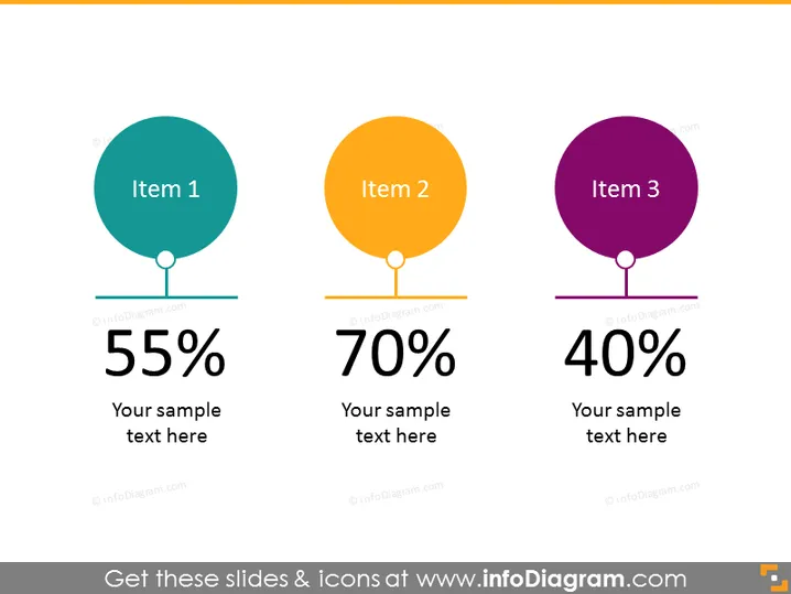
The PowerPoint slide displays three key items, each associated with a distinct color, a percentage, and a space for descriptive text. "Item 1" is paired with "55%," "Item 2" with "70%," and "Item 3" with "40%." This indicates a comparative analysis, where each item likely represents a different aspect being measured, with the percentages reflecting levels of completion, satisfaction, or another metric.
The slide uses a clean and minimalist design with a neutral background that makes the colorful elements stand out. The visual emphasis on the percentage figures indicates their importance in the slide's message.


