Your graphics add a nice touch to my presentations and I recently used them for one of my all-hands meetings. Your toolbox adds professionalism to my slides. Instead of using standard clipart.
Claude Jones, Director of Engineer, @Walmartlabs, USA
Your graphics add a nice touch to my presentations and I recently used them for one of my all-hands meetings. Your toolbox adds professionalism to my slides. Instead of using standard clipart.
Claude Jones, Director of Engineer, @Walmartlabs, USA
I needed a fresh look at some of my slides. I've tried to find a way to create a paintbrush effect, to underline, accentuate, add some color and the handwritten markers were just the things. Very easy to use, easy to size, change the color. It was an affordable, perfect solution and I'm happy to recommend it.
Anonymous, US
The crisp, clean look of the graphics, and the fact that it allowed me to easily edit and change the colors to match the template was my main reason for purchasing them.
Brandie Jenkins, E-learning Developer, USA
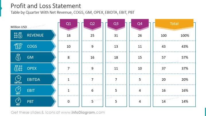
The slide presents a detailed Profit and Loss Statement, outlining the financial performance by quarter. It includes key metrics such as Revenue, COGS (Cost of Goods Sold), GM (Gross Margin), OPEX (Operating Expenses), EBITDA (Earnings Before Interest, Taxes, Depreciation, and Amortization), EBIT (Earnings Before Interest and Taxes), and PBT (Profit Before Tax), with corresponding figures given for each quarter (Q1 through Q4) and total values. Each metric is crucial for evaluating a company’s financial health: Revenue indicates the total income, COGS represents the direct costs of producing goods, GM shows profitability after deducting COGS, OPEX signifies the costs of operation, and the various EBITDA, EBIT, and PBT indicators give insights into profit at different stages of accounting.
The slide is clean and corporate, using a limited color palette with blue tones and a contrasting golden color for the total column. Icons associated with each metric aid visual representation.


