Your graphics add a nice touch to my presentations and I recently used them for one of my all-hands meetings. Your toolbox adds professionalism to my slides. Instead of using standard clipart.
Claude Jones, Director of Engineer, @Walmartlabs, USA
Your graphics add a nice touch to my presentations and I recently used them for one of my all-hands meetings. Your toolbox adds professionalism to my slides. Instead of using standard clipart.
Claude Jones, Director of Engineer, @Walmartlabs, USA
I needed a fresh look at some of my slides. I've tried to find a way to create a paintbrush effect, to underline, accentuate, add some color and the handwritten markers were just the things. Very easy to use, easy to size, change the color. It was an affordable, perfect solution and I'm happy to recommend it.
Anonymous, US
The crisp, clean look of the graphics, and the fact that it allowed me to easily edit and change the colors to match the template was my main reason for purchasing them.
Brandie Jenkins, E-learning Developer, USA
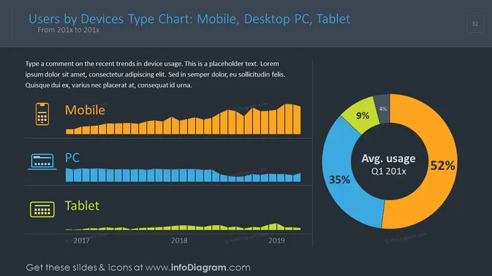
The slide presents a data comparison among mobile, desktop PC, and tablet users over a certain period, from 201x to 201x. Each device type has a corresponding bar chart that displays the trend of usage. Additionally, an average usage pie chart for Q1 201x breaks down the percentages. Mobiles show a consistent or growing trend, desktop PCs possibly indicate a decline, whereas tablets depict a minor usage. The written content suggests an analysis of these trends, but it's placeholder text.
The graphics and icons used are simple yet informative, providing an at-a-glance understanding of the data trends. Color-coding for each device type unifies the theme and makes the data immediately recognizable.


