Your graphics add a nice touch to my presentations and I recently used them for one of my all-hands meetings. Your toolbox adds professionalism to my slides. Instead of using standard clipart.
Claude Jones, Director of Engineer, @Walmartlabs, USA
Your graphics add a nice touch to my presentations and I recently used them for one of my all-hands meetings. Your toolbox adds professionalism to my slides. Instead of using standard clipart.
Claude Jones, Director of Engineer, @Walmartlabs, USA
I needed a fresh look at some of my slides. I've tried to find a way to create a paintbrush effect, to underline, accentuate, add some color and the handwritten markers were just the things. Very easy to use, easy to size, change the color. It was an affordable, perfect solution and I'm happy to recommend it.
Anonymous, US
The crisp, clean look of the graphics, and the fact that it allowed me to easily edit and change the colors to match the template was my main reason for purchasing them.
Brandie Jenkins, E-learning Developer, USA
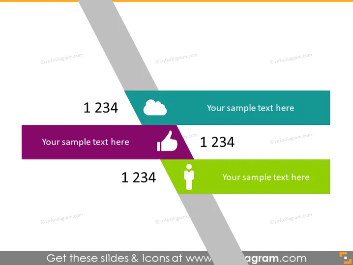
The PowerPoint slide seems to be a template for displaying key metrics or ideas with accompanying symbols and text. There are four colorful banners, each containing a large number "1234," which appears to be a placeholder for actual data or points. Next to the figures, there's space for additional explanatory text or a title for the metric. Icons are placed beside the sample text, each representing different themes—a cloud, a thumbs up, and a person symbol—hinting at metrics related to technology, approval, and individual performance or demographics.
The overall look of the slide is sleek and professional, with a dynamic use of color and shapes that draw attention to the key elements. The design allows for easy customization while clearly conveying essential information at a glance.


