Your graphics add a nice touch to my presentations and I recently used them for one of my all-hands meetings. Your toolbox adds professionalism to my slides. Instead of using standard clipart.
Claude Jones, Director of Engineer, @Walmartlabs, USA
Your graphics add a nice touch to my presentations and I recently used them for one of my all-hands meetings. Your toolbox adds professionalism to my slides. Instead of using standard clipart.
Claude Jones, Director of Engineer, @Walmartlabs, USA
I needed a fresh look at some of my slides. I've tried to find a way to create a paintbrush effect, to underline, accentuate, add some color and the handwritten markers were just the things. Very easy to use, easy to size, change the color. It was an affordable, perfect solution and I'm happy to recommend it.
Anonymous, US
The crisp, clean look of the graphics, and the fact that it allowed me to easily edit and change the colors to match the template was my main reason for purchasing them.
Brandie Jenkins, E-learning Developer, USA
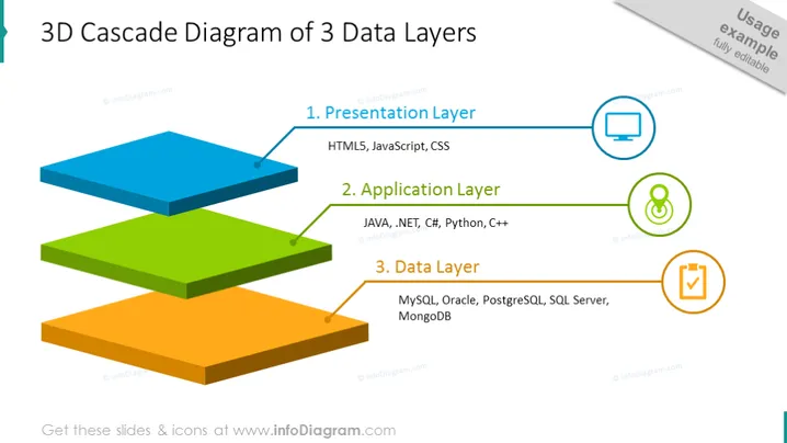
The slide presents the structure of a three-tiered data system using a 3D cascading diagram. It illustrates the following components: (1) Presentation Layer, which mentions technologies like HTML5, JavaScript, and CSS; this is the layer that interfaces with the user. (2) Application Layer, listing programming languages and frameworks such as JAVA, .NET, C#, Python, and C++; these comprise the logic that processes the user's actions. (3) Data Layer, which contains database technologies like MySQL, Oracle, PostgreSQL, SQL Server, and MongoDB, signifying the storage and management of data.
The slide has a clean, professional, and modern design, effectively visualizing the concept of a layered data architecture with the use of flat design elements and icons. The use of distinct colors for each layer improves visual separation and comprehension.


