Your graphics add a nice touch to my presentations and I recently used them for one of my all-hands meetings. Your toolbox adds professionalism to my slides. Instead of using standard clipart.
Claude Jones, Director of Engineer, @Walmartlabs, USA
Your graphics add a nice touch to my presentations and I recently used them for one of my all-hands meetings. Your toolbox adds professionalism to my slides. Instead of using standard clipart.
Claude Jones, Director of Engineer, @Walmartlabs, USA
I needed a fresh look at some of my slides. I've tried to find a way to create a paintbrush effect, to underline, accentuate, add some color and the handwritten markers were just the things. Very easy to use, easy to size, change the color. It was an affordable, perfect solution and I'm happy to recommend it.
Anonymous, US
The crisp, clean look of the graphics, and the fact that it allowed me to easily edit and change the colors to match the template was my main reason for purchasing them.
Brandie Jenkins, E-learning Developer, USA
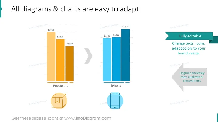
The slide is likely showcasing the adaptability features of diagrams and charts used in presentations. It compares sales values of "Product A" and "iPhone," with the former having scale values at $100B, $120B, and $140B, and the latter at $138B, $141B, and $167B. "Product A" has two depicted values, while iPhone has three bars illustrating gradual sales increase. The side of the slide mentions the diagrams are "Fully editable," suggesting that text, icons, colors, and size can be modified. It also states "Ungroup and easily copy, duplicate or remove items," indicating further customization options. Each feature provides users with the ability to tailor the presentation to specific branding or design needs.
The overall look of the slide is professional and clean, with a focus on readability and visual comparison between two data sets. The contrasting colors for the different products and the clear annotations make the information easily digestible.


