Your graphics add a nice touch to my presentations and I recently used them for one of my all-hands meetings. Your toolbox adds professionalism to my slides. Instead of using standard clipart.
Claude Jones, Director of Engineer, @Walmartlabs, USA
Your graphics add a nice touch to my presentations and I recently used them for one of my all-hands meetings. Your toolbox adds professionalism to my slides. Instead of using standard clipart.
Claude Jones, Director of Engineer, @Walmartlabs, USA
I needed a fresh look at some of my slides. I've tried to find a way to create a paintbrush effect, to underline, accentuate, add some color and the handwritten markers were just the things. Very easy to use, easy to size, change the color. It was an affordable, perfect solution and I'm happy to recommend it.
Anonymous, US
The crisp, clean look of the graphics, and the fact that it allowed me to easily edit and change the colors to match the template was my main reason for purchasing them.
Brandie Jenkins, E-learning Developer, USA
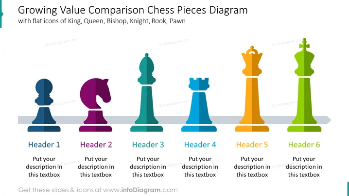
The slide is a Growing Value Comparison Chess Pieces Diagram, illustrating a metaphorical comparison of values or importance using chess pieces. Each chess piece, from the pawn to the king, progressively increases in size and is associated with a unique color. There are six headers, each corresponding to a chess piece: Header 1 for a Pawn, Header 2 for a Knight, Header 3 for a Bishop, Header 4 for a Rook, Header 5 for a Queen, and Header 6 for a King. The Pawn, representing the least value or starting point, leads up to the King, signifying the highest value or ultimate goal.
The slide has a professional and modern visual appeal that clearly represents a hierarchy or progression. The use of chess icons adds a strategy or competition theme to the information being presented.


