Your graphics add a nice touch to my presentations and I recently used them for one of my all-hands meetings. Your toolbox adds professionalism to my slides. Instead of using standard clipart.
Claude Jones, Director of Engineer, @Walmartlabs, USA
Your graphics add a nice touch to my presentations and I recently used them for one of my all-hands meetings. Your toolbox adds professionalism to my slides. Instead of using standard clipart.
Claude Jones, Director of Engineer, @Walmartlabs, USA
I needed a fresh look at some of my slides. I've tried to find a way to create a paintbrush effect, to underline, accentuate, add some color and the handwritten markers were just the things. Very easy to use, easy to size, change the color. It was an affordable, perfect solution and I'm happy to recommend it.
Anonymous, US
The crisp, clean look of the graphics, and the fact that it allowed me to easily edit and change the colors to match the template was my main reason for purchasing them.
Brandie Jenkins, E-learning Developer, USA
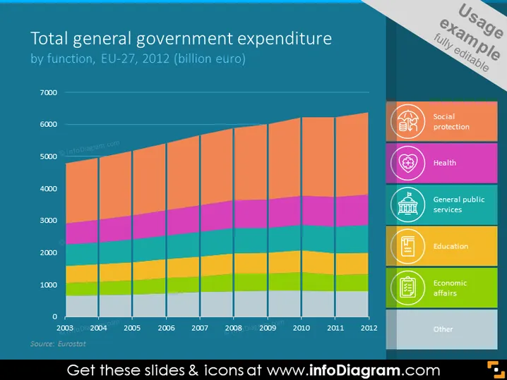
The slide depicts a stacked bar chart illustrating the total general government expenditure of the EU-27 countries in 2012, segmented by various government functions such as social protection, health, general public services, education, economic affairs, and others. Each segment represents a different area of expenditure and their respective proportions in relation to the total expenditure. Social protection appears to be the largest segment, indicating it's the area where the most funds are allocated.
The slide has a clean and modern design with easily distinguishable colors and clearly labeled sections that facilitate quick comprehension. The icons are simple yet effective in visually representing the different categories of government expenditure.


