Your graphics add a nice touch to my presentations and I recently used them for one of my all-hands meetings. Your toolbox adds professionalism to my slides. Instead of using standard clipart.
Claude Jones, Director of Engineer, @Walmartlabs, USA
Your graphics add a nice touch to my presentations and I recently used them for one of my all-hands meetings. Your toolbox adds professionalism to my slides. Instead of using standard clipart.
Claude Jones, Director of Engineer, @Walmartlabs, USA
I needed a fresh look at some of my slides. I've tried to find a way to create a paintbrush effect, to underline, accentuate, add some color and the handwritten markers were just the things. Very easy to use, easy to size, change the color. It was an affordable, perfect solution and I'm happy to recommend it.
Anonymous, US
The crisp, clean look of the graphics, and the fact that it allowed me to easily edit and change the colors to match the template was my main reason for purchasing them.
Brandie Jenkins, E-learning Developer, USA
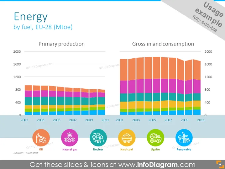
The PowerPoint slide titled "Energy by fuel, EU-28 (Mtoe)" presents data on the primary production and gross inland consumption of energy over a period from 2001 to 2011 across the 28 member countries of the European Union. The slide visually compares the two categories through stacked bar graphs, indicating a complex mix of various energy sources such as oil, natural gas, nuclear, hard coal, lignite, and renewables. Each source is color-coded and represented proportionally within each bar, providing clear insight into the energy mix and trends.
The slide is neatly organized and uses a clear visual language with color-coded elements to convey statistics about energy production and consumption. Icons are used effectively to aid understanding at a glance.


