Your graphics add a nice touch to my presentations and I recently used them for one of my all-hands meetings. Your toolbox adds professionalism to my slides. Instead of using standard clipart.
Claude Jones, Director of Engineer, @Walmartlabs, USA
Your graphics add a nice touch to my presentations and I recently used them for one of my all-hands meetings. Your toolbox adds professionalism to my slides. Instead of using standard clipart.
Claude Jones, Director of Engineer, @Walmartlabs, USA
I needed a fresh look at some of my slides. I've tried to find a way to create a paintbrush effect, to underline, accentuate, add some color and the handwritten markers were just the things. Very easy to use, easy to size, change the color. It was an affordable, perfect solution and I'm happy to recommend it.
Anonymous, US
The crisp, clean look of the graphics, and the fact that it allowed me to easily edit and change the colors to match the template was my main reason for purchasing them.
Brandie Jenkins, E-learning Developer, USA
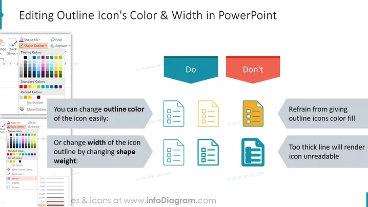
This slide instructs on proper techniques for altering the appearance of outline icons within PowerPoint. It differentiates between recommended (Do) and discouraged (Don't) practices. The "Do" section elucidates that you can easily change the outline color of an icon, which means selecting a different color for the lines that make up the icon. Additionally, the width of the icon's outline can be adjusted by changing the shape weight, clarifying that you can modify how thick or thin the outline appears. The "Don't" part advises against giving outline icons a color fill, which means filling the inside of the icon with color, and cautions that too thick a line will make the icon unreadable, referring to setting the outline too wide, which can obscure the icon's details.
The slide has a clean and professional design with a well-organized layout, effectively showing comparison by using visual examples. Icons are used for illustration, and screenshots of tool menus drive home the instruction on how to apply changes in PowerPoint.


