Your graphics add a nice touch to my presentations and I recently used them for one of my all-hands meetings. Your toolbox adds professionalism to my slides. Instead of using standard clipart.
Claude Jones, Director of Engineer, @Walmartlabs, USA
Your graphics add a nice touch to my presentations and I recently used them for one of my all-hands meetings. Your toolbox adds professionalism to my slides. Instead of using standard clipart.
Claude Jones, Director of Engineer, @Walmartlabs, USA
I needed a fresh look at some of my slides. I've tried to find a way to create a paintbrush effect, to underline, accentuate, add some color and the handwritten markers were just the things. Very easy to use, easy to size, change the color. It was an affordable, perfect solution and I'm happy to recommend it.
Anonymous, US
The crisp, clean look of the graphics, and the fact that it allowed me to easily edit and change the colors to match the template was my main reason for purchasing them.
Brandie Jenkins, E-learning Developer, USA
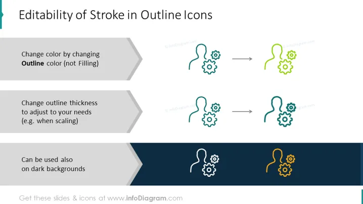
The slide illustrates three key features of editable stroke in outline icons which are: changing the outline color (emphasizing that it's not the filling that changes), adjusting the outline thickness to meet specific needs such as scaling, and the adaptability of the icons for use on dark backgrounds. Each feature is further explained: changing the outline color to customize the appearance, adjusting thickness for visibility during scaling, and ensuring visibility on various background colors.
The slide is crisp and uses a minimal design, emphasizing clarity and directness in comprehending the content. The strategic use of colors assists in explaining the adaptability of stroke adjustments in outline icons.


