Your graphics add a nice touch to my presentations and I recently used them for one of my all-hands meetings. Your toolbox adds professionalism to my slides. Instead of using standard clipart.
Claude Jones, Director of Engineer, @Walmartlabs, USA
Your graphics add a nice touch to my presentations and I recently used them for one of my all-hands meetings. Your toolbox adds professionalism to my slides. Instead of using standard clipart.
Claude Jones, Director of Engineer, @Walmartlabs, USA
I needed a fresh look at some of my slides. I've tried to find a way to create a paintbrush effect, to underline, accentuate, add some color and the handwritten markers were just the things. Very easy to use, easy to size, change the color. It was an affordable, perfect solution and I'm happy to recommend it.
Anonymous, US
The crisp, clean look of the graphics, and the fact that it allowed me to easily edit and change the colors to match the template was my main reason for purchasing them.
Brandie Jenkins, E-learning Developer, USA
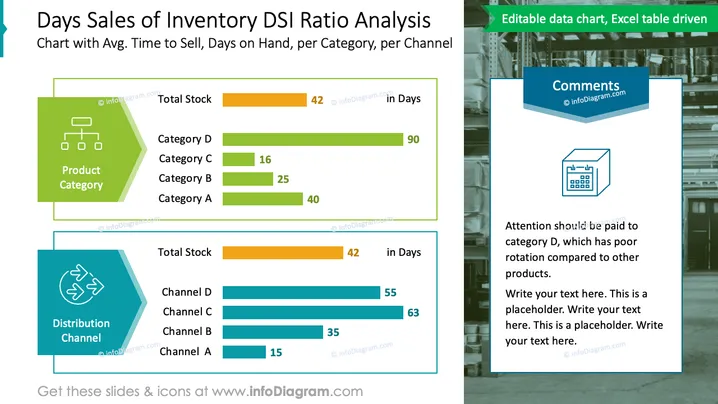
The slide presents an analysis of the Days Sales of Inventory (DSI) ratio, offering insights into the average time it takes to sell inventory categorized by product categories and distribution channels. It displays 'Total Stock in Days' for comparison, highlighting the performance of each category and channel. Product categories A, B, C, and D have varying days on hand, with Category D showing significantly higher days at 90, indicating slow turnover. Similarly, distribution channels A through D are compared, with Channel A demonstrating the best performance at 15 days.
The slide is visually organized with clear, distinct sections for product categories and distribution channels, complemented by a graphical warehouse backdrop that ties into the inventory theme. The use of color coding and horizontal bar charts facilitates quick comparison and analysis.


