Your graphics add a nice touch to my presentations and I recently used them for one of my all-hands meetings. Your toolbox adds professionalism to my slides. Instead of using standard clipart.
Claude Jones, Director of Engineer, @Walmartlabs, USA
Your graphics add a nice touch to my presentations and I recently used them for one of my all-hands meetings. Your toolbox adds professionalism to my slides. Instead of using standard clipart.
Claude Jones, Director of Engineer, @Walmartlabs, USA
I needed a fresh look at some of my slides. I've tried to find a way to create a paintbrush effect, to underline, accentuate, add some color and the handwritten markers were just the things. Very easy to use, easy to size, change the color. It was an affordable, perfect solution and I'm happy to recommend it.
Anonymous, US
The crisp, clean look of the graphics, and the fact that it allowed me to easily edit and change the colors to match the template was my main reason for purchasing them.
Brandie Jenkins, E-learning Developer, USA
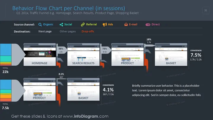
The slide represents a behavior flow chart detailing user sessions across various channels for a hypothetical Q1 period. It showcases the flow of user traffic from a homepage to other pages like search results, product page, and shopping basket, with accompanying metrics for total sessions, the percentage progressing to each subsequent stage, and drop-offs. Each page stage is quantified with total visitor numbers and conversion rates, giving insights into user navigation and engagement within a website, which is critical for analyzing the effectiveness of web funnels and making data-driven decisions for site optimization.
The slide is highly visual with its use of browser window graphics and connective bars to illustrate user flow. The color-coding for different traffic sources and stages of the user journey enhances comprehension and quick assessment.


