Your graphics add a nice touch to my presentations and I recently used them for one of my all-hands meetings. Your toolbox adds professionalism to my slides. Instead of using standard clipart.
Claude Jones, Director of Engineer, @Walmartlabs, USA
Your graphics add a nice touch to my presentations and I recently used them for one of my all-hands meetings. Your toolbox adds professionalism to my slides. Instead of using standard clipart.
Claude Jones, Director of Engineer, @Walmartlabs, USA
I needed a fresh look at some of my slides. I've tried to find a way to create a paintbrush effect, to underline, accentuate, add some color and the handwritten markers were just the things. Very easy to use, easy to size, change the color. It was an affordable, perfect solution and I'm happy to recommend it.
Anonymous, US
The crisp, clean look of the graphics, and the fact that it allowed me to easily edit and change the colors to match the template was my main reason for purchasing them.
Brandie Jenkins, E-learning Developer, USA
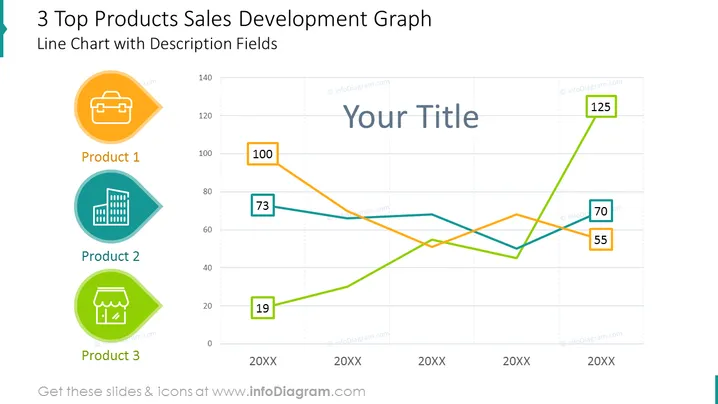
The slide is titled "3 Top Products Sales Development Graph" and includes a Line Chart with Description Fields. It visually represents the sales development of three products over three time points labeled "20XX". The products are individually associated with colored lines and labeled with unique icons — a briefcase for Product 1, a building for Product 2, and a storefront for Product 3. Data points are marked with values such as 100, 73, and 125 for Product 1, indicating different sales figures at each time point.
The overall look of the slide is professional and clear, with a focus on the line graph that effectively conveys the sales data of three distinct products. The use of color and icons helps to differentiate between the products, making the information easily understandable at a glance.


