Your graphics add a nice touch to my presentations and I recently used them for one of my all-hands meetings. Your toolbox adds professionalism to my slides. Instead of using standard clipart.
Claude Jones, Director of Engineer, @Walmartlabs, USA
Your graphics add a nice touch to my presentations and I recently used them for one of my all-hands meetings. Your toolbox adds professionalism to my slides. Instead of using standard clipart.
Claude Jones, Director of Engineer, @Walmartlabs, USA
I needed a fresh look at some of my slides. I've tried to find a way to create a paintbrush effect, to underline, accentuate, add some color and the handwritten markers were just the things. Very easy to use, easy to size, change the color. It was an affordable, perfect solution and I'm happy to recommend it.
Anonymous, US
The crisp, clean look of the graphics, and the fact that it allowed me to easily edit and change the colors to match the template was my main reason for purchasing them.
Brandie Jenkins, E-learning Developer, USA
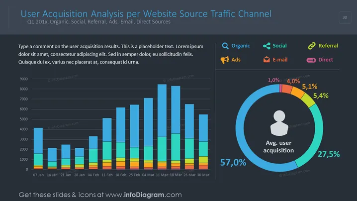
The slide presents an analysis of user acquisition by various traffic channels like organic search, social media, referrals, advertisements, emails, and direct sources for the first quarter of an unspecified year. There's a bar graph showing user acquisition over several weeks, each bar intuitively split to reflect contributions from different channels. The slide also includes a circular infographic representing the average user acquisition percentages by these channels. A placeholder text box encourages the presentation designer to comment on the results shown.
The slide has a professional and polished look, using a dark theme that enhances the vibrancy of the color-coded charts. The insightful use of graphical elements provides a clear visual representation of complex data.


