Your graphics add a nice touch to my presentations and I recently used them for one of my all-hands meetings. Your toolbox adds professionalism to my slides. Instead of using standard clipart.
Claude Jones, Director of Engineer, @Walmartlabs, USA
Your graphics add a nice touch to my presentations and I recently used them for one of my all-hands meetings. Your toolbox adds professionalism to my slides. Instead of using standard clipart.
Claude Jones, Director of Engineer, @Walmartlabs, USA
I needed a fresh look at some of my slides. I've tried to find a way to create a paintbrush effect, to underline, accentuate, add some color and the handwritten markers were just the things. Very easy to use, easy to size, change the color. It was an affordable, perfect solution and I'm happy to recommend it.
Anonymous, US
The crisp, clean look of the graphics, and the fact that it allowed me to easily edit and change the colors to match the template was my main reason for purchasing them.
Brandie Jenkins, E-learning Developer, USA
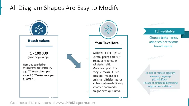
The slide presents information about the ease of modification of diagram shapes in a presentation. It features two text boxes and a corresponding icon for each. The first text box, labeled "Reach Values," provides an example range of "1 - 100000" and suggests defining measurements such as "Transactions per month" or "Customers per quarter." The second text box encourages the user to add their text and demonstrates how customizable the content is; the box includes placeholder text with "Lorem Ipsum" filler content. Additionally, a small text box with the label "Fully editable" details that you can change texts, icons, adapt colors to your brand, and resize elements. It also gives instructions on how to edit the diagram elements by ungrouping them.
The slide employs a clean and professional look with a straightforward layout that emphasizes ease of customization through minimal design elements. The use of iconic symbols paired with associated text content provides a visual anchor for the viewer.


