Your graphics add a nice touch to my presentations and I recently used them for one of my all-hands meetings. Your toolbox adds professionalism to my slides. Instead of using standard clipart.
Claude Jones, Director of Engineer, @Walmartlabs, USA
Your graphics add a nice touch to my presentations and I recently used them for one of my all-hands meetings. Your toolbox adds professionalism to my slides. Instead of using standard clipart.
Claude Jones, Director of Engineer, @Walmartlabs, USA
I needed a fresh look at some of my slides. I've tried to find a way to create a paintbrush effect, to underline, accentuate, add some color and the handwritten markers were just the things. Very easy to use, easy to size, change the color. It was an affordable, perfect solution and I'm happy to recommend it.
Anonymous, US
The crisp, clean look of the graphics, and the fact that it allowed me to easily edit and change the colors to match the template was my main reason for purchasing them.
Brandie Jenkins, E-learning Developer, USA
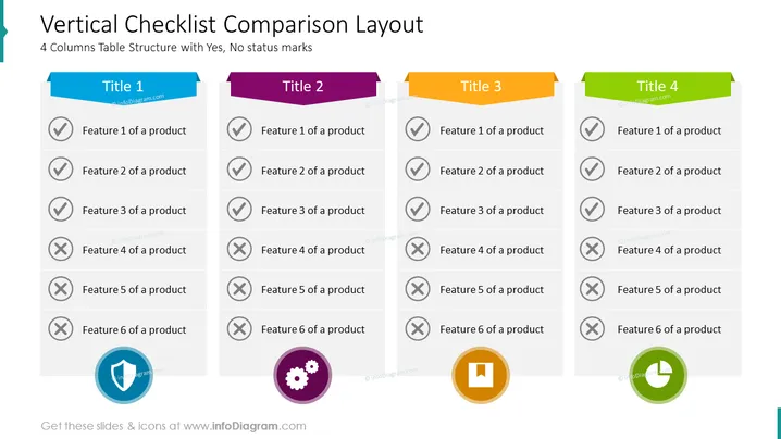
4 Columns Table Structure with Yes, No status marks
The slide titled "Vertical Checklist Comparison Layout" compares four different products across a range of six features. For each feature, the slide indicates whether it is present (tick mark) or absent (cross mark) in the product. "Title 1" features a majority of absent features, only having the first three. In contrast, "Title 2" and "Title 3" show a mix of present and absent features, while "Title 4" incorporates all features except for the fifth one. This layout facilitates an easy visual comparison of product characteristics or offerings side-by-side.
The slide has a clean and structured layout, with each column separated neatly to facilitate direct visual comparison. The use of color coding and distinct icons at the bottom of each column adds to the clarity and visual appeal.


