
Your graphics add a nice touch to my presentations and I recently used them for one of my all-hands meetings. Your toolbox adds professionalism to my slides. Instead of using standard clipart.
Claude Jones, Director of Engineer, @Walmartlabs, USA
Your graphics add a nice touch to my presentations and I recently used them for one of my all-hands meetings. Your toolbox adds professionalism to my slides. Instead of using standard clipart.
Claude Jones, Director of Engineer, @Walmartlabs, USA
I needed a fresh look at some of my slides. I've tried to find a way to create a paintbrush effect, to underline, accentuate, add some color and the handwritten markers were just the things. Very easy to use, easy to size, change the color. It was an affordable, perfect solution and I'm happy to recommend it.
Anonymous, US
The crisp, clean look of the graphics, and the fact that it allowed me to easily edit and change the colors to match the template was my main reason for purchasing them.
Brandie Jenkins, E-learning Developer, USA
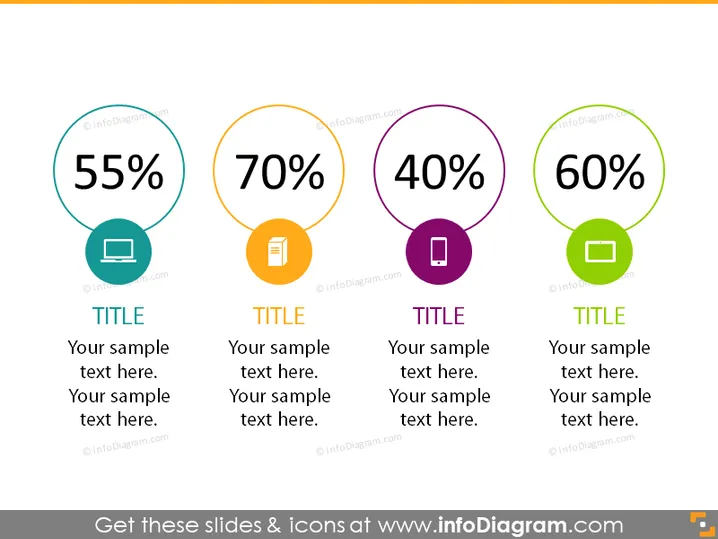
O slide do PowerPoint exibe quatro elementos gráficos circulares diferentes, cada um representando um valor percentual único e associado a um ícone e cor específicos. Os percentuais mostrados são 55%, 70%, 40% e 60%, cada um em um círculo distinto. Estes provavelmente indicam métricas como desempenho, conclusão, satisfação ou outros dados mensuráveis. Abaixo de cada círculo, há um espaço reservado para um título e texto adicional de amostra, sugerindo que cada métrica pode ser explicada ou contextualizada de forma mais detalhada.




