Your graphics add a nice touch to my presentations and I recently used them for one of my all-hands meetings. Your toolbox adds professionalism to my slides. Instead of using standard clipart.
Claude Jones, Director of Engineer, @Walmartlabs, USA
Your graphics add a nice touch to my presentations and I recently used them for one of my all-hands meetings. Your toolbox adds professionalism to my slides. Instead of using standard clipart.
Claude Jones, Director of Engineer, @Walmartlabs, USA
I needed a fresh look at some of my slides. I've tried to find a way to create a paintbrush effect, to underline, accentuate, add some color and the handwritten markers were just the things. Very easy to use, easy to size, change the color. It was an affordable, perfect solution and I'm happy to recommend it.
Anonymous, US
The crisp, clean look of the graphics, and the fact that it allowed me to easily edit and change the colors to match the template was my main reason for purchasing them.
Brandie Jenkins, E-learning Developer, USA
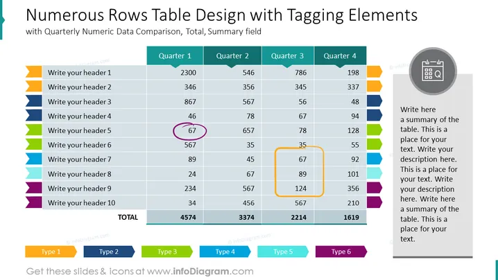
O slide apresenta uma tabela de dados estruturada voltada para exibir e comparar dados numéricos ao longo de quatro trimestres. A tabela é dividida em dez linhas, rotuladas com espaços reservados para cabeçalhos, e quatro colunas correspondentes a cada trimestre. Os dados parecem ser métricas de desempenho ou números financeiros com totais na linha inferior, enfatizando o aspecto cumulativo dos dados. Elementos de marcação, como ícones coloridos e células destacadas, são usados para organizar ou priorizar informações, indicando diferentes tipos ou categorias para referência rápida e análise.


