

Your graphics add a nice touch to my presentations and I recently used them for one of my all-hands meetings. Your toolbox adds professionalism to my slides. Instead of using standard clipart.
Claude Jones, Director of Engineer, @Walmartlabs, USA

Your graphics add a nice touch to my presentations and I recently used them for one of my all-hands meetings. Your toolbox adds professionalism to my slides. Instead of using standard clipart.
Claude Jones, Director of Engineer, @Walmartlabs, USA
I needed a fresh look at some of my slides. I've tried to find a way to create a paintbrush effect, to underline, accentuate, add some color and the handwritten markers were just the things. Very easy to use, easy to size, change the color. It was an affordable, perfect solution and I'm happy to recommend it.
Anonymous, US
The crisp, clean look of the graphics, and the fact that it allowed me to easily edit and change the colors to match the template was my main reason for purchasing them.
Brandie Jenkins, E-learning Developer, USA
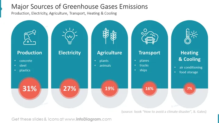
O slide apresenta uma divisão das principais fontes de emissões de gases de efeito estufa, divididas em quatro categorias: Produção, Eletricidade, Agricultura e Aquecimento & Resfriamento. Cada categoria apresenta uma porcentagem das emissões e exemplos específicos:
Essas categorias ajudam a entender onde os esforços podem ser concentrados para reduzir as emissões de gases de efeito estufa.
O visual geral é moderno e limpo, com um estilo iconográfico consistente que categoriza visualmente a informação. O uso de cores e gráficos destaca efetivamente as informações chave e permite uma rápida compreensão à primeira vista.



