

Your graphics add a nice touch to my presentations and I recently used them for one of my all-hands meetings. Your toolbox adds professionalism to my slides. Instead of using standard clipart.
Claude Jones, Director of Engineer, @Walmartlabs, USA

Your graphics add a nice touch to my presentations and I recently used them for one of my all-hands meetings. Your toolbox adds professionalism to my slides. Instead of using standard clipart.
Claude Jones, Director of Engineer, @Walmartlabs, USA
I needed a fresh look at some of my slides. I've tried to find a way to create a paintbrush effect, to underline, accentuate, add some color and the handwritten markers were just the things. Very easy to use, easy to size, change the color. It was an affordable, perfect solution and I'm happy to recommend it.
Anonymous, US
The crisp, clean look of the graphics, and the fact that it allowed me to easily edit and change the colors to match the template was my main reason for purchasing them.
Brandie Jenkins, E-learning Developer, USA
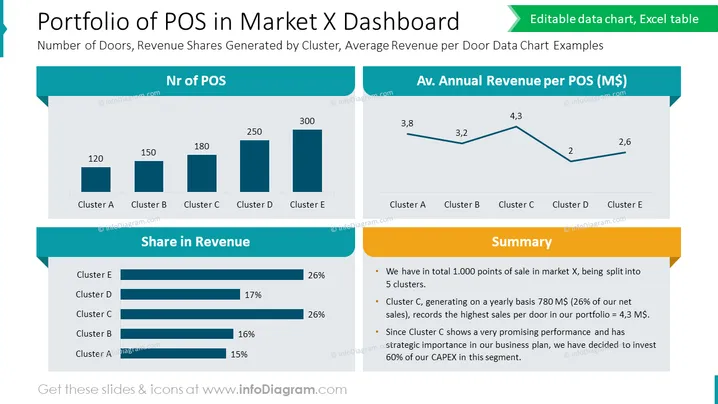
O slide intitulado "Portfólio de POS no Dashboard do Mercado X" apresenta dados sobre a distribuição e o desempenho financeiro dos pontos de venda (POS) em diferentes clusters em um mercado. Ele mostra o "Número de Portas, Participações na Receita Geradas por Cluster, Exemplos de Gráficos de Dados de Receita Média por Porta." O número de POS por cluster é ilustrado em um gráfico de barras para os clusters A a E, sugerindo a magnitude das operações em cada cluster. Além disso, a "Participação na Receita" é mostrada em barras horizontais, indicando a dominância do Cluster E, que está empatado com o Cluster D. Um gráfico de linha ilustra a "Receita Média Anual por POS (M$)," onde o Cluster C tem a maior receita média. Por fim, uma seção de "Resumo" destaca as principais informações: 1.000 POS no total, o Cluster C reivindicando uma participação significativa nas vendas anuais e planos para investir fortemente neste segmento promissor.



