

Your graphics add a nice touch to my presentations and I recently used them for one of my all-hands meetings. Your toolbox adds professionalism to my slides. Instead of using standard clipart.
Claude Jones, Director of Engineer, @Walmartlabs, USA

Your graphics add a nice touch to my presentations and I recently used them for one of my all-hands meetings. Your toolbox adds professionalism to my slides. Instead of using standard clipart.
Claude Jones, Director of Engineer, @Walmartlabs, USA
I needed a fresh look at some of my slides. I've tried to find a way to create a paintbrush effect, to underline, accentuate, add some color and the handwritten markers were just the things. Very easy to use, easy to size, change the color. It was an affordable, perfect solution and I'm happy to recommend it.
Anonymous, US
The crisp, clean look of the graphics, and the fact that it allowed me to easily edit and change the colors to match the template was my main reason for purchasing them.
Brandie Jenkins, E-learning Developer, USA
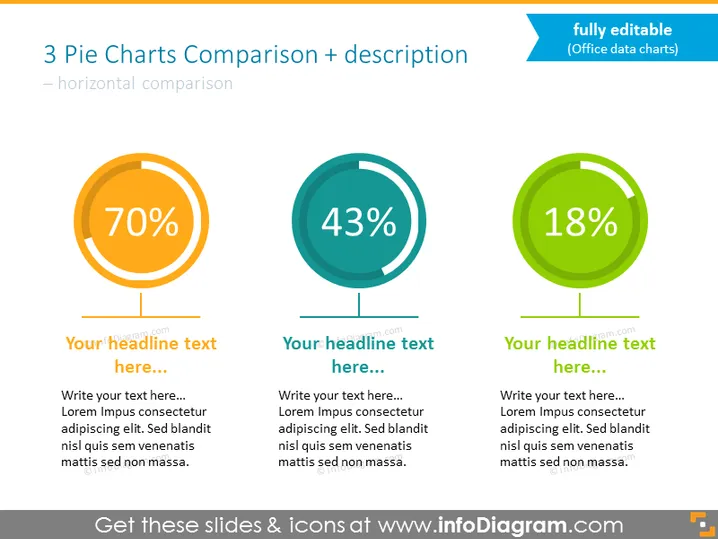
Compare 3 métricas percentuais usando este slide audacioso com gráficos de pizza. Discuta números com diagramas apresentando resultados na forma de anéis coloridos ilustrando participações. Todos os gráficos neste slide são gráficos dinâmicos do Excel, fáceis de modificar e implementar suas estatísticas. Adicione descrições e títulos, e você estará pronto para apresentar.
Este Template de Gráficos Baseados em Dados com Percentual e Espaço para Descrição é parte de nossos Gráficos de Apresentação Dinâmica Baseados em Dados PPT.



