

Your graphics add a nice touch to my presentations and I recently used them for one of my all-hands meetings. Your toolbox adds professionalism to my slides. Instead of using standard clipart.
Claude Jones, Director of Engineer, @Walmartlabs, USA

Your graphics add a nice touch to my presentations and I recently used them for one of my all-hands meetings. Your toolbox adds professionalism to my slides. Instead of using standard clipart.
Claude Jones, Director of Engineer, @Walmartlabs, USA
I needed a fresh look at some of my slides. I've tried to find a way to create a paintbrush effect, to underline, accentuate, add some color and the handwritten markers were just the things. Very easy to use, easy to size, change the color. It was an affordable, perfect solution and I'm happy to recommend it.
Anonymous, US
The crisp, clean look of the graphics, and the fact that it allowed me to easily edit and change the colors to match the template was my main reason for purchasing them.
Brandie Jenkins, E-learning Developer, USA
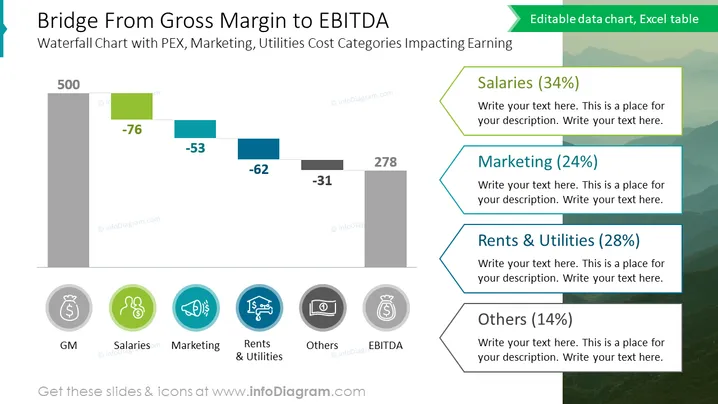
O slide apresenta um gráfico em cascata explicando a transição da Margem Bruta (MB) para EBITDA, com cada elemento representando uma categoria de custo e seu impacto nos lucros. As categorias incluem Salários (34% de algum valor), Marketing (24%), Aluguel e Utilidades (28%) e Outros (14%). Cada categoria é mostrada com uma porcentagem correspondente e tem espaço para descrição adicional.
O slide tem um design profissional e limpo, com uma hierarquia visual clara. O uso de codificação por cores e ícones ajuda a transmitir rapidamente as diferentes categorias de custo que estão afetando a transição da Margem Bruta para EBITDA.



