Your graphics add a nice touch to my presentations and I recently used them for one of my all-hands meetings. Your toolbox adds professionalism to my slides. Instead of using standard clipart.
Claude Jones, Director of Engineer, @Walmartlabs, USA
Your graphics add a nice touch to my presentations and I recently used them for one of my all-hands meetings. Your toolbox adds professionalism to my slides. Instead of using standard clipart.
Claude Jones, Director of Engineer, @Walmartlabs, USA
I needed a fresh look at some of my slides. I've tried to find a way to create a paintbrush effect, to underline, accentuate, add some color and the handwritten markers were just the things. Very easy to use, easy to size, change the color. It was an affordable, perfect solution and I'm happy to recommend it.
Anonymous, US
The crisp, clean look of the graphics, and the fact that it allowed me to easily edit and change the colors to match the template was my main reason for purchasing them.
Brandie Jenkins, E-learning Developer, USA
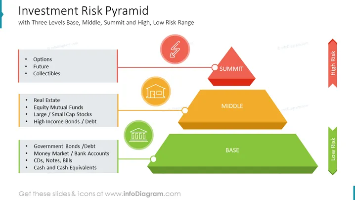
Este slide do PowerPoint fornece uma visão clara e concisa da pirâmide de risco de investimento, ilustrando a relação entre risco e potencial de retorno para várias classes de ativos. A pirâmide é dividida em três níveis – base, meio e cume – representando investimentos de baixo, moderado e alto risco, respectivamente. O slide transmite efetivamente o conceito de que investimentos de maior risco geralmente oferecem o potencial de retornos mais altos, mas também apresentam uma maior chance de perda. Este infográfico pode ser usado em apresentações de negócios para educar investidores sobre a relação risco-retorno e guiá-los na tomada de decisões de investimento informadas.
Este Slide da Pirâmide de Risco de Investimento é parte de nosso Template de Gráficos de Apresentação de Pirâmides de Risco de Investimento.


