Your graphics add a nice touch to my presentations and I recently used them for one of my all-hands meetings. Your toolbox adds professionalism to my slides. Instead of using standard clipart.
Claude Jones, Director of Engineer, @Walmartlabs, USA
Your graphics add a nice touch to my presentations and I recently used them for one of my all-hands meetings. Your toolbox adds professionalism to my slides. Instead of using standard clipart.
Claude Jones, Director of Engineer, @Walmartlabs, USA
I needed a fresh look at some of my slides. I've tried to find a way to create a paintbrush effect, to underline, accentuate, add some color and the handwritten markers were just the things. Very easy to use, easy to size, change the color. It was an affordable, perfect solution and I'm happy to recommend it.
Anonymous, US
The crisp, clean look of the graphics, and the fact that it allowed me to easily edit and change the colors to match the template was my main reason for purchasing them.
Brandie Jenkins, E-learning Developer, USA
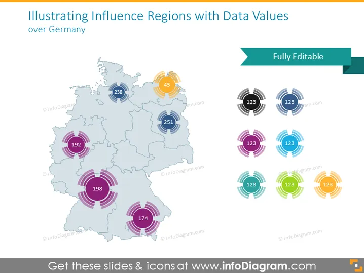
O slide do PowerPoint apresenta valores de dados para diferentes regiões de influência na Alemanha. Um mapa da Alemanha é usado para exibir várias regiões com dados numéricos associados a locais específicos. Os números provavelmente representam alguma medida quantitativa, como volume de vendas, população ou métricas de desempenho. Eles variam em tamanhos, denotando a magnitude ou importância dos valores. Os círculos ao redor, com cores diferentes, indicam o alcance ou área de influência de cada valor, proporcionando uma representação visual do impacto ou relevância.


