Your graphics add a nice touch to my presentations and I recently used them for one of my all-hands meetings. Your toolbox adds professionalism to my slides. Instead of using standard clipart.
Claude Jones, Director of Engineer, @Walmartlabs, USA
Your graphics add a nice touch to my presentations and I recently used them for one of my all-hands meetings. Your toolbox adds professionalism to my slides. Instead of using standard clipart.
Claude Jones, Director of Engineer, @Walmartlabs, USA
I needed a fresh look at some of my slides. I've tried to find a way to create a paintbrush effect, to underline, accentuate, add some color and the handwritten markers were just the things. Very easy to use, easy to size, change the color. It was an affordable, perfect solution and I'm happy to recommend it.
Anonymous, US
The crisp, clean look of the graphics, and the fact that it allowed me to easily edit and change the colors to match the template was my main reason for purchasing them.
Brandie Jenkins, E-learning Developer, USA
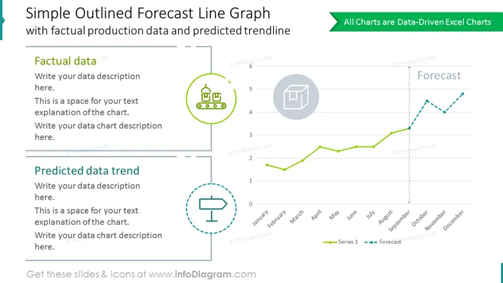
Este gráfico de linhas simples e elegante apresenta o desempenho real e previsto em um único diagrama. Além do gráfico impulsionado por dados do Excel, você pode utilizar dois contêineres de texto para descrever as tendências de dados factuais e previstas. Ilustre as estatísticas de produção ao longo do ano.
Este Gráfico de Linha de Previsão em Modelo Simples de Contorno é parte do nosso Modelo PPT de Gráficos Baseados em Dados de Gráfico de Linhas.


