

Your graphics add a nice touch to my presentations and I recently used them for one of my all-hands meetings. Your toolbox adds professionalism to my slides. Instead of using standard clipart.
Claude Jones, Director of Engineer, @Walmartlabs, USA

Your graphics add a nice touch to my presentations and I recently used them for one of my all-hands meetings. Your toolbox adds professionalism to my slides. Instead of using standard clipart.
Claude Jones, Director of Engineer, @Walmartlabs, USA
I needed a fresh look at some of my slides. I've tried to find a way to create a paintbrush effect, to underline, accentuate, add some color and the handwritten markers were just the things. Very easy to use, easy to size, change the color. It was an affordable, perfect solution and I'm happy to recommend it.
Anonymous, US
The crisp, clean look of the graphics, and the fact that it allowed me to easily edit and change the colors to match the template was my main reason for purchasing them.
Brandie Jenkins, E-learning Developer, USA
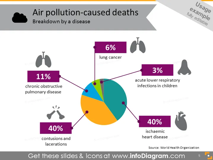
O slide apresenta uma divisão estatística das mortes causadas pela poluição do ar por doença, ilustrada em formato de gráfico de pizza. O maior segmento, com 40%, é atribuído à doença cardíaca isquêmica, destacando o impacto significativo da poluição do ar na saúde do coração. Outros 40% são compartilhados por contusões e lacerações, indicando que o trauma é uma causa comparável. A doença pulmonar obstrutiva crônica representa 11%, ressaltando sua relevância na mortalidade relacionada à poluição do ar. O câncer de pulmão e as infecções respiratórias agudas em crianças representam 6% e 3%, respectivamente, enfatizando suas participações menores, mas notáveis.



