Your graphics add a nice touch to my presentations and I recently used them for one of my all-hands meetings. Your toolbox adds professionalism to my slides. Instead of using standard clipart.
Claude Jones, Director of Engineer, @Walmartlabs, USA
Your graphics add a nice touch to my presentations and I recently used them for one of my all-hands meetings. Your toolbox adds professionalism to my slides. Instead of using standard clipart.
Claude Jones, Director of Engineer, @Walmartlabs, USA
I needed a fresh look at some of my slides. I've tried to find a way to create a paintbrush effect, to underline, accentuate, add some color and the handwritten markers were just the things. Very easy to use, easy to size, change the color. It was an affordable, perfect solution and I'm happy to recommend it.
Anonymous, US
The crisp, clean look of the graphics, and the fact that it allowed me to easily edit and change the colors to match the template was my main reason for purchasing them.
Brandie Jenkins, E-learning Developer, USA
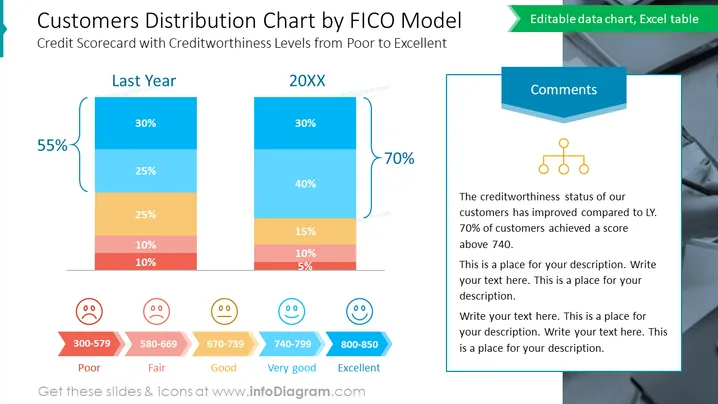
O slide compara a distribuição da solvência dos clientes entre o ano passado e o ano atual, utilizando um gráfico de barras empilhadas vertical, com cada segmento codificado por cores de acordo com a faixa de pontuação FICO. "Ano Passado" mostra uma mudança negativa de 55% na distribuição dos clientes, com a maioria pontuando na faixa de "Ruim" a "Regular". Em contrapartida, "20XX" apresenta um aumento positivo de 70% nas categorias "Muito Bom" e "Excelente", indicando uma melhoria nas pontuações de crédito dos clientes.
O slide apresenta um design contemporâneo.


