Your graphics add a nice touch to my presentations and I recently used them for one of my all-hands meetings. Your toolbox adds professionalism to my slides. Instead of using standard clipart.
Claude Jones, Director of Engineer, @Walmartlabs, USA
Your graphics add a nice touch to my presentations and I recently used them for one of my all-hands meetings. Your toolbox adds professionalism to my slides. Instead of using standard clipart.
Claude Jones, Director of Engineer, @Walmartlabs, USA
I needed a fresh look at some of my slides. I've tried to find a way to create a paintbrush effect, to underline, accentuate, add some color and the handwritten markers were just the things. Very easy to use, easy to size, change the color. It was an affordable, perfect solution and I'm happy to recommend it.
Anonymous, US
The crisp, clean look of the graphics, and the fact that it allowed me to easily edit and change the colors to match the template was my main reason for purchasing them.
Brandie Jenkins, E-learning Developer, USA
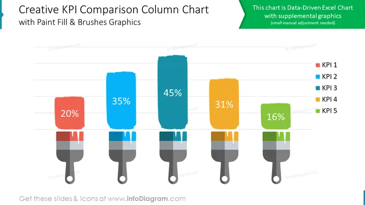
O slide do PowerPoint apresenta um gráfico de colunas comparativo para visualizar Indicadores-Chave de Desempenho (KPIs). O gráfico exibe cinco KPIs: KPI 1, KPI 2, KPI 3, KPI 4 e KPI 5. Os valores de cada KPI são representados pela altura das colunas correspondentes. O gráfico utiliza preenchimento com tinta e gráficos de pincéis para aumentar o apelo visual da comparação de dados. O gráfico inclui uma nota indicando que é um gráfico do Excel baseado em dados com gráficos suplementares.
Você pode usar um slide como este em uma variedade de contextos, como:


