

Your graphics add a nice touch to my presentations and I recently used them for one of my all-hands meetings. Your toolbox adds professionalism to my slides. Instead of using standard clipart.
Claude Jones, Director of Engineer, @Walmartlabs, USA

Your graphics add a nice touch to my presentations and I recently used them for one of my all-hands meetings. Your toolbox adds professionalism to my slides. Instead of using standard clipart.
Claude Jones, Director of Engineer, @Walmartlabs, USA
I needed a fresh look at some of my slides. I've tried to find a way to create a paintbrush effect, to underline, accentuate, add some color and the handwritten markers were just the things. Very easy to use, easy to size, change the color. It was an affordable, perfect solution and I'm happy to recommend it.
Anonymous, US
The crisp, clean look of the graphics, and the fact that it allowed me to easily edit and change the colors to match the template was my main reason for purchasing them.
Brandie Jenkins, E-learning Developer, USA
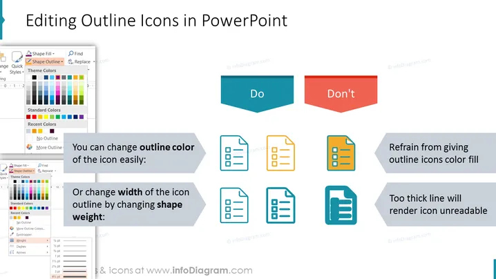
O slide apresenta diretrizes sobre como editar corretamente ícones de contorno no PowerPoint para manter clareza e legibilidade. Recomenda-se que se pode facilmente alterar a cor do contorno do ícone ou ajustar a largura do contorno do ícone alterando o peso da forma. Por outro lado, é desaconselhado preencher ícones de contorno com cor ou usar linhas que sejam muito grossas, pois essas práticas podem tornar os ícones difíceis de ler. Cada ponto é demonstrado com exemplos pictóricos mostrando os métodos preferidos e desestimados.



