Your graphics add a nice touch to my presentations and I recently used them for one of my all-hands meetings. Your toolbox adds professionalism to my slides. Instead of using standard clipart.
Claude Jones, Director of Engineer, @Walmartlabs, USA
Your graphics add a nice touch to my presentations and I recently used them for one of my all-hands meetings. Your toolbox adds professionalism to my slides. Instead of using standard clipart.
Claude Jones, Director of Engineer, @Walmartlabs, USA
I needed a fresh look at some of my slides. I've tried to find a way to create a paintbrush effect, to underline, accentuate, add some color and the handwritten markers were just the things. Very easy to use, easy to size, change the color. It was an affordable, perfect solution and I'm happy to recommend it.
Anonymous, US
The crisp, clean look of the graphics, and the fact that it allowed me to easily edit and change the colors to match the template was my main reason for purchasing them.
Brandie Jenkins, E-learning Developer, USA
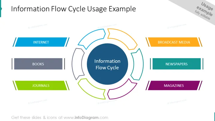
O slide do PowerPoint descreve um conceito chamado "Ciclo de Fluxo de Informação", representado por um diagrama circular central cercado por segmentos rotulados. Cada segmento representa uma fonte de informação: Internet (destacada com duas linhas azuis), Livros (em cinza escuro), Periódicos (em verde), Mídia de Broadcast (com duas linhas laranja), Jornal (em azul-petróleo) e Revistas (em roxo). A Internet implica fontes online, Livros sugerem literatura tradicional, Periódicos denotam artigos acadêmicos, Mídia de Broadcast significa TV e rádio, Jornais indicam notícias escritas diárias e Revistas implicam publicações periódicas.


