

Your graphics add a nice touch to my presentations and I recently used them for one of my all-hands meetings. Your toolbox adds professionalism to my slides. Instead of using standard clipart.
Claude Jones, Director of Engineer, @Walmartlabs, USA

Your graphics add a nice touch to my presentations and I recently used them for one of my all-hands meetings. Your toolbox adds professionalism to my slides. Instead of using standard clipart.
Claude Jones, Director of Engineer, @Walmartlabs, USA
I needed a fresh look at some of my slides. I've tried to find a way to create a paintbrush effect, to underline, accentuate, add some color and the handwritten markers were just the things. Very easy to use, easy to size, change the color. It was an affordable, perfect solution and I'm happy to recommend it.
Anonymous, US
The crisp, clean look of the graphics, and the fact that it allowed me to easily edit and change the colors to match the template was my main reason for purchasing them.
Brandie Jenkins, E-learning Developer, USA
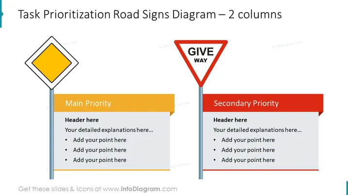
O slide apresenta uma metáfora visual para priorização de tarefas usando sinais de trânsito. Ele distingue claramente entre "Prioridade Principal" e "Prioridade Secundária." A prioridade principal é simbolizada por um sinal de diamante amarelo, enquanto a prioridade secundária é indicada por um sinal vermelho e branco de "DÊ PASSAGEM." Cada prioridade tem espaço para um cabeçalho e pontos com marcadores para detalhar tarefas ou critérios específicos, ajudando o público a distinguir a urgência e a importância das tarefas à primeira vista.



