
Your graphics add a nice touch to my presentations and I recently used them for one of my all-hands meetings. Your toolbox adds professionalism to my slides. Instead of using standard clipart.
Claude Jones, Director of Engineer, @Walmartlabs, USA

Your graphics add a nice touch to my presentations and I recently used them for one of my all-hands meetings. Your toolbox adds professionalism to my slides. Instead of using standard clipart.
Claude Jones, Director of Engineer, @Walmartlabs, USA
I needed a fresh look at some of my slides. I've tried to find a way to create a paintbrush effect, to underline, accentuate, add some color and the handwritten markers were just the things. Very easy to use, easy to size, change the color. It was an affordable, perfect solution and I'm happy to recommend it.
Anonymous, US
The crisp, clean look of the graphics, and the fact that it allowed me to easily edit and change the colors to match the template was my main reason for purchasing them.
Brandie Jenkins, E-learning Developer, USA
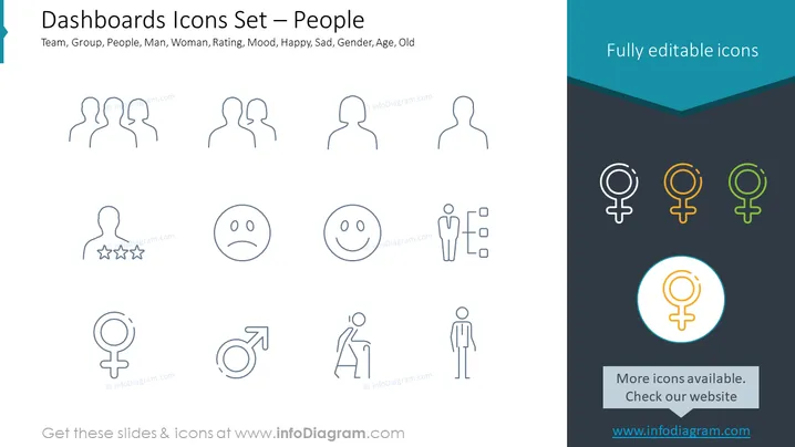
O slide parece estar apresentando um conjunto de ícones relacionados a pessoas para uso em aplicações de dashboard. Os títulos incluem termos como "Equipe," "Grupo," "Pessoas," "Homem," "Mulher," "Avaliação," "Humor," "Feliz," "Triste," "Gênero," "Idade," e "Velho." Estes representam diferentes categorias ou filtros que podem ser usados dentro de um dashboard para classificar ou representar dados. Cada termo indica um aspecto específico da demografia ou características humanas, sugerindo uma abordagem abrangente para categorizar indivíduos para fins analíticos ou de apresentação.
O design do slide é direto e utiliza ícones de forma eficaz para comunicar diferentes categorias sociais e demográficas. Essa simplicidade permite uma fácil compreensão e um rápido processamento visual para os espectadores.