Your graphics add a nice touch to my presentations and I recently used them for one of my all-hands meetings. Your toolbox adds professionalism to my slides. Instead of using standard clipart.
Claude Jones, Director of Engineer, @Walmartlabs, USA
Your graphics add a nice touch to my presentations and I recently used them for one of my all-hands meetings. Your toolbox adds professionalism to my slides. Instead of using standard clipart.
Claude Jones, Director of Engineer, @Walmartlabs, USA
I needed a fresh look at some of my slides. I've tried to find a way to create a paintbrush effect, to underline, accentuate, add some color and the handwritten markers were just the things. Very easy to use, easy to size, change the color. It was an affordable, perfect solution and I'm happy to recommend it.
Anonymous, US
The crisp, clean look of the graphics, and the fact that it allowed me to easily edit and change the colors to match the template was my main reason for purchasing them.
Brandie Jenkins, E-learning Developer, USA
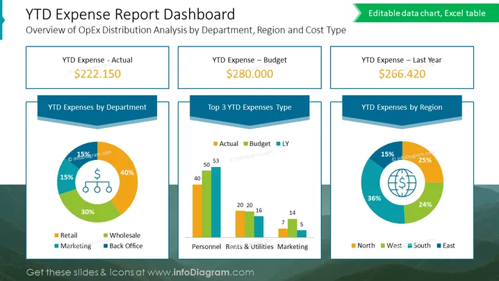
The slide presents a "YTD Expense Report Dashboard" with an overview of operational expenditure distribution analyzed by department, region, and cost type. It features three key financial metrics: "YTD Expense - Actual," "YTD Expense – Budget," and "YTD Expense – Last Year," with corresponding figures that suggest a financial assessment or comparison scenario. Additionally, there are three pie charts depicting "YTD Expenses by Department," "Top 3 YTD Expenses Type," and "YTD Expenses by Region," each offering a visual breakdown of expenses.
The overall visual look of the slide is clean and corporate, with a structured layout that compartmentalizes information for quick and efficient data uptake. The use of colors and shapes is thoughtfully done to distinguish different data sets while maintaining a cohesive design.


