Your graphics add a nice touch to my presentations and I recently used them for one of my all-hands meetings. Your toolbox adds professionalism to my slides. Instead of using standard clipart.
Claude Jones, Director of Engineer, @Walmartlabs, USA
Your graphics add a nice touch to my presentations and I recently used them for one of my all-hands meetings. Your toolbox adds professionalism to my slides. Instead of using standard clipart.
Claude Jones, Director of Engineer, @Walmartlabs, USA
I needed a fresh look at some of my slides. I've tried to find a way to create a paintbrush effect, to underline, accentuate, add some color and the handwritten markers were just the things. Very easy to use, easy to size, change the color. It was an affordable, perfect solution and I'm happy to recommend it.
Anonymous, US
The crisp, clean look of the graphics, and the fact that it allowed me to easily edit and change the colors to match the template was my main reason for purchasing them.
Brandie Jenkins, E-learning Developer, USA
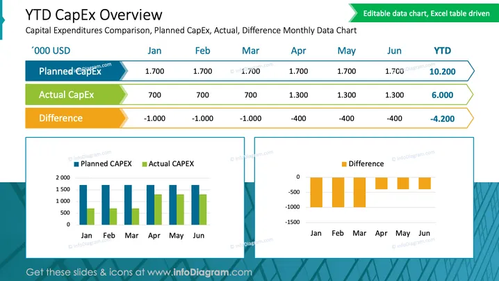
The slide is titled "YTD CapEx Overview" and sub-titled "Capital Expenditures Comparison, Planned CapEx, Actual, Difference Monthly Data Chart." It features a chart that compares the planned and actual capital expenditures (CapEx) as well as the difference between them for each month, from January to June, and including the year-to-date (YTD) totals. Planned CapEx appears consistent at 1,700 '000 USD for each month. Actual CapEx shows variation, with a YTD total of 6,000 '000 USD. The Difference indicates under-spending in earlier months with improvement noted in later months, culminating in a YTD difference of -4,200 '000 USD.
The slide has a clean and professional look with a good color scheme to differentiate data sets. The use of both vertical and horizontal bar charts allows for an easy comparison of planned versus actual expenditures and their respective differences.


