Your graphics add a nice touch to my presentations and I recently used them for one of my all-hands meetings. Your toolbox adds professionalism to my slides. Instead of using standard clipart.
Claude Jones, Director of Engineer, @Walmartlabs, USA
Your graphics add a nice touch to my presentations and I recently used them for one of my all-hands meetings. Your toolbox adds professionalism to my slides. Instead of using standard clipart.
Claude Jones, Director of Engineer, @Walmartlabs, USA
I needed a fresh look at some of my slides. I've tried to find a way to create a paintbrush effect, to underline, accentuate, add some color and the handwritten markers were just the things. Very easy to use, easy to size, change the color. It was an affordable, perfect solution and I'm happy to recommend it.
Anonymous, US
The crisp, clean look of the graphics, and the fact that it allowed me to easily edit and change the colors to match the template was my main reason for purchasing them.
Brandie Jenkins, E-learning Developer, USA
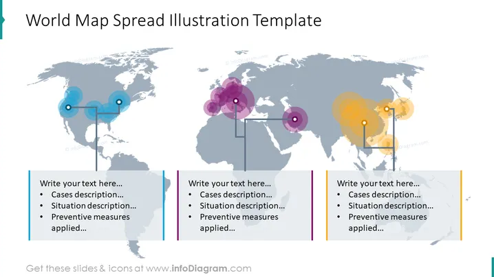
The slide titled "World Map Spread Illustration Template" appears to be a tool for presenting data with a geographic component. There are three text boxes where the presenter can insert descriptions, including "Cases description," "Situation description," and "Preventive measures applied." Each box is associated with a graphical element—colored circles with varying opacities placed over a world map—that likely represents different regions or intensity of the case studies.
The overall look of the slide is modern and clean, utilizing minimalistic design elements to focus on the data representation. The color-coding and spatial arrangement effectively direct attention to specific geographic areas.


