Your graphics add a nice touch to my presentations and I recently used them for one of my all-hands meetings. Your toolbox adds professionalism to my slides. Instead of using standard clipart.
Claude Jones, Director of Engineer, @Walmartlabs, USA
Your graphics add a nice touch to my presentations and I recently used them for one of my all-hands meetings. Your toolbox adds professionalism to my slides. Instead of using standard clipart.
Claude Jones, Director of Engineer, @Walmartlabs, USA
I needed a fresh look at some of my slides. I've tried to find a way to create a paintbrush effect, to underline, accentuate, add some color and the handwritten markers were just the things. Very easy to use, easy to size, change the color. It was an affordable, perfect solution and I'm happy to recommend it.
Anonymous, US
The crisp, clean look of the graphics, and the fact that it allowed me to easily edit and change the colors to match the template was my main reason for purchasing them.
Brandie Jenkins, E-learning Developer, USA
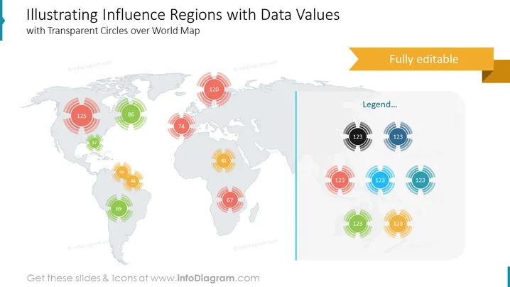
This PowerPoint slide presents a world map overlaid with transparent color-coded concentric circles of varying sizes, each labeled with a number to indicate data values representing influence or impact in different regions. The slide includes a legend on the right side that explains the meaning of the colored circles and their associated numbers. The purpose is to visualize quantitative data geographically to showcase areas of influence, market size, or other region-specific metrics in a visually engaging way.
The slide is designed with a clean and modern aesthetic, employing transparency to create depth while maintaining readability. The use of color-coding and concentric circles effectively conveys relative magnitudes and facilitates comparison across regions.


