Your graphics add a nice touch to my presentations and I recently used them for one of my all-hands meetings. Your toolbox adds professionalism to my slides. Instead of using standard clipart.
Claude Jones, Director of Engineer, @Walmartlabs, USA
Your graphics add a nice touch to my presentations and I recently used them for one of my all-hands meetings. Your toolbox adds professionalism to my slides. Instead of using standard clipart.
Claude Jones, Director of Engineer, @Walmartlabs, USA
I needed a fresh look at some of my slides. I've tried to find a way to create a paintbrush effect, to underline, accentuate, add some color and the handwritten markers were just the things. Very easy to use, easy to size, change the color. It was an affordable, perfect solution and I'm happy to recommend it.
Anonymous, US
The crisp, clean look of the graphics, and the fact that it allowed me to easily edit and change the colors to match the template was my main reason for purchasing them.
Brandie Jenkins, E-learning Developer, USA
Shapes:
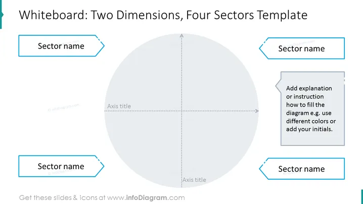
The main graphical object on the slide is the four-sector diagram. The diagram is made up of four rectangles, which are arranged in a grid. The rectangles are all the same size and shape.
Colors:
The main colors used on the slide are black and white. The background of the slide is white, and the diagram, axis titles, prompt text, and infoDiagram logo are all black.
Visual Composition:
The four-sector diagram is the focal point of the slide. It is placed in the center of the slide and is surrounded by white space. The axis titles are placed above and below the diagram, and the prompt text is placed below the diagram. The infoDiagram logo is placed in the bottom right corner of the slide.
Overall, the slide has a simple and clean design. The black-and-white color scheme is easy to read and the four-sector diagram is clearly visible. The slide is also well-organized, with the different graphical elements arranged in a logical way.


