Your graphics add a nice touch to my presentations and I recently used them for one of my all-hands meetings. Your toolbox adds professionalism to my slides. Instead of using standard clipart.
Claude Jones, Director of Engineer, @Walmartlabs, USA
Your graphics add a nice touch to my presentations and I recently used them for one of my all-hands meetings. Your toolbox adds professionalism to my slides. Instead of using standard clipart.
Claude Jones, Director of Engineer, @Walmartlabs, USA
I needed a fresh look at some of my slides. I've tried to find a way to create a paintbrush effect, to underline, accentuate, add some color and the handwritten markers were just the things. Very easy to use, easy to size, change the color. It was an affordable, perfect solution and I'm happy to recommend it.
Anonymous, US
The crisp, clean look of the graphics, and the fact that it allowed me to easily edit and change the colors to match the template was my main reason for purchasing them.
Brandie Jenkins, E-learning Developer, USA
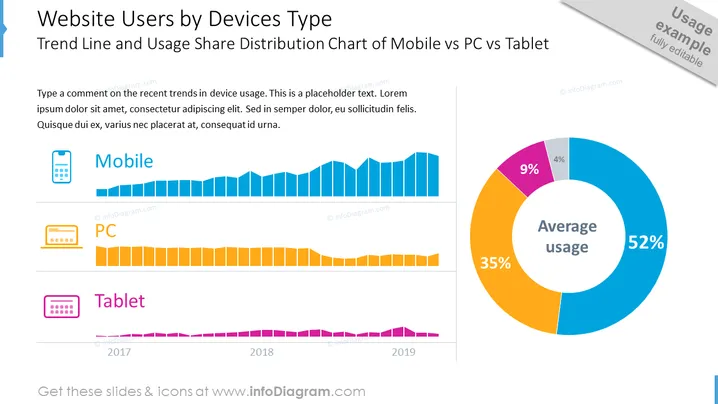
The PowerPoint slide titled "Website Users by Devices Type" provides an analysis of the trend in device usage, specifically comparing mobile, PC, and tablet. The slide shows a trend line for each device category over the years 2017 to 2019. The mobile trend line exhibits a significant upward trajectory, illustrating its increasing dominance. The PC trend line displays a moderate decline, signifying its reduced role. The tablet trend exhibits a slight decrease over time, indicating a marginal drop in its usage. Additionally, there's a pie chart labeled "Average usage" which quantifies the percentage distribution among the three device types—mobile, PC, and tablet—with mobile being the most used at 52%.
The slide uses contrasting colors and clear visual elements to distinguish between device types and their usage trends. The design is modern and clean, with a professional look suitable for business and analytical presentations.


