Your graphics add a nice touch to my presentations and I recently used them for one of my all-hands meetings. Your toolbox adds professionalism to my slides. Instead of using standard clipart.
Claude Jones, Director of Engineer, @Walmartlabs, USA
Your graphics add a nice touch to my presentations and I recently used them for one of my all-hands meetings. Your toolbox adds professionalism to my slides. Instead of using standard clipart.
Claude Jones, Director of Engineer, @Walmartlabs, USA
I needed a fresh look at some of my slides. I've tried to find a way to create a paintbrush effect, to underline, accentuate, add some color and the handwritten markers were just the things. Very easy to use, easy to size, change the color. It was an affordable, perfect solution and I'm happy to recommend it.
Anonymous, US
The crisp, clean look of the graphics, and the fact that it allowed me to easily edit and change the colors to match the template was my main reason for purchasing them.
Brandie Jenkins, E-learning Developer, USA
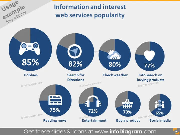
This slide presents a comparison of the popularity of various web services related to information and interests. Displayed are six categories: "Hobbies," shown as most popular with 85%, suggests leisure-related online activities; "Search for Directions," at 82%, indicates the high usage of navigation services; "Check weather," with 80%, highlights the frequent checking of weather forecasts; "Info search on buying products," at 77%, reflects online research for purchase decisions; "Reading news," with 75%, shows the significance of staying updated via the web; "Entertainment," with 72%, encompasses streaming and gaming; "Buy a product," at 70%, signifies e-commerce activities; "Social media," the least popular at 65%, still denotes a substantial part of online interaction.
The overall look of the slide is clean and professional, with a straightforward layout allowing for easy comparison between the categories. The icons and percentages are presented in a manner that quickly conveys the data's key points.
This slide could be used in a marketing presentation to highlight areas of highest consumer interest for web services.
It could serve in a business strategy session when deciding which online service sectors to invest in or develop further.
The slide ### Use Cases
This slide could be used in a marketing presentation to highlight areas of highest consumer interest for web services.
It could serve in a business strategy session when deciding which online service sectors to invest in or develop further.
The slide might be useful in an investment meeting to discuss the popularity trends of various web services and guide future investments.
It could also be valuable in a product development presentation to target areas within web services that are most appealing to users, aiming to improve service offerings or create new features.


