Your graphics add a nice touch to my presentations and I recently used them for one of my all-hands meetings. Your toolbox adds professionalism to my slides. Instead of using standard clipart.
Claude Jones, Director of Engineer, @Walmartlabs, USA
Your graphics add a nice touch to my presentations and I recently used them for one of my all-hands meetings. Your toolbox adds professionalism to my slides. Instead of using standard clipart.
Claude Jones, Director of Engineer, @Walmartlabs, USA
I needed a fresh look at some of my slides. I've tried to find a way to create a paintbrush effect, to underline, accentuate, add some color and the handwritten markers were just the things. Very easy to use, easy to size, change the color. It was an affordable, perfect solution and I'm happy to recommend it.
Anonymous, US
The crisp, clean look of the graphics, and the fact that it allowed me to easily edit and change the colors to match the template was my main reason for purchasing them.
Brandie Jenkins, E-learning Developer, USA
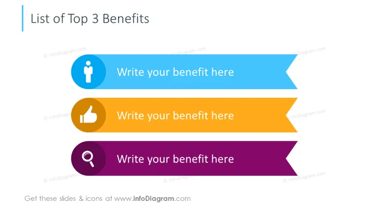
The slide is designed to present the top three benefits of a product, service, or concept. Each benefit is allocated a distinct space, denoted with a colorful banner and accompanied by an icon that visualizes the nature of the benefit. For example, a person icon may represent a benefit related to personal development or customer service, a thumbs-up icon might suggest approval or satisfaction, and a magnifying glass could be associated with insight or discovery.
The visual composition of the slide is minimalistic and attention-grabbing with a clear emphasis on the content inside the arrow-shaped banners. The use of contrasting colors and icons effectively segments the information and creates a visually appealing hierarchy.


