
Your graphics add a nice touch to my presentations and I recently used them for one of my all-hands meetings. Your toolbox adds professionalism to my slides. Instead of using standard clipart.
Claude Jones, Director of Engineer, @Walmartlabs, USA

Your graphics add a nice touch to my presentations and I recently used them for one of my all-hands meetings. Your toolbox adds professionalism to my slides. Instead of using standard clipart.
Claude Jones, Director of Engineer, @Walmartlabs, USA

I needed a fresh look at some of my slides. I've tried to find a way to create a paintbrush effect, to underline, accentuate, add some color and the handwritten markers were just the things. Very easy to use, easy to size, change the color. It was an affordable, perfect solution and I'm happy to recommend it.
Anonymous, US
The crisp, clean look of the graphics, and the fact that it allowed me to easily edit and change the colors to match the template was my main reason for purchasing them.
Brandie Jenkins, E-learning Developer, USA
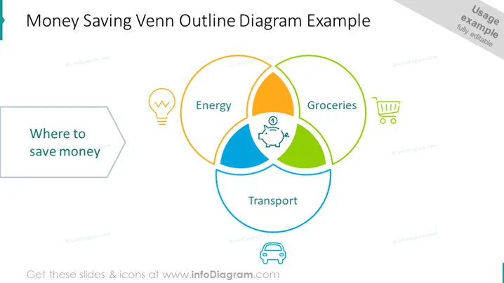
The slide presents a Venn diagram illustrating potential areas to save money. The diagram has three overlapping circles labeled "Energy," "Transport," and "Groceries," each paired with an icon representing the category (a light bulb for energy, a shopping cart for groceries, and a car for transport). The central overlapping area is marked with a piggy bank icon, symbolizing the core money-saving opportunities where all three categories intersect.
The overall look of the slide is simple and clean, with a focused use of icons and color to designate different areas related to saving money. The visual structure is guided by the Venn diagram, which serves to illustrate the interrelated aspects of cost-saving.


