Your graphics add a nice touch to my presentations and I recently used them for one of my all-hands meetings. Your toolbox adds professionalism to my slides. Instead of using standard clipart.
Claude Jones, Director of Engineer, @Walmartlabs, USA
Your graphics add a nice touch to my presentations and I recently used them for one of my all-hands meetings. Your toolbox adds professionalism to my slides. Instead of using standard clipart.
Claude Jones, Director of Engineer, @Walmartlabs, USA
I needed a fresh look at some of my slides. I've tried to find a way to create a paintbrush effect, to underline, accentuate, add some color and the handwritten markers were just the things. Very easy to use, easy to size, change the color. It was an affordable, perfect solution and I'm happy to recommend it.
Anonymous, US
The crisp, clean look of the graphics, and the fact that it allowed me to easily edit and change the colors to match the template was my main reason for purchasing them.
Brandie Jenkins, E-learning Developer, USA
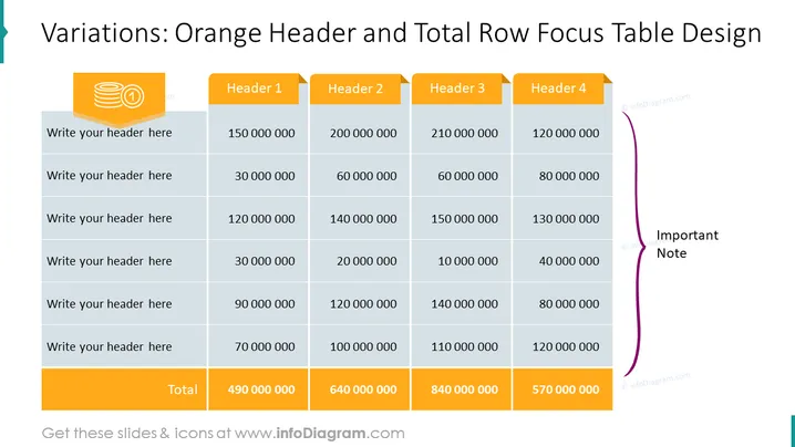
Slide Content: This PowerPoint slide presents a table designed to compare numerical data across four categories, labeled as Header 1 through Header 4. It's structured to draw attention to the totals of each category, highlighted in orange at the bottom row. Each row above the total is for a different item or variable, which can be detailed by inserting a header description, with the numeric values extending from left to right in the corresponding columns. An "Important Note" section is placed to the right of the table, emphasizing additional information that may complement the data presented.
Graphical Look:
The slide has a professional, clear layout, with strong visual cues directing attention to the total row and important note section. The use of color is strategic and enhances the readability of data.
Use Cases:


