Your graphics add a nice touch to my presentations and I recently used them for one of my all-hands meetings. Your toolbox adds professionalism to my slides. Instead of using standard clipart.
Claude Jones, Director of Engineer, @Walmartlabs, USA
Your graphics add a nice touch to my presentations and I recently used them for one of my all-hands meetings. Your toolbox adds professionalism to my slides. Instead of using standard clipart.
Claude Jones, Director of Engineer, @Walmartlabs, USA
I needed a fresh look at some of my slides. I've tried to find a way to create a paintbrush effect, to underline, accentuate, add some color and the handwritten markers were just the things. Very easy to use, easy to size, change the color. It was an affordable, perfect solution and I'm happy to recommend it.
Anonymous, US
The crisp, clean look of the graphics, and the fact that it allowed me to easily edit and change the colors to match the template was my main reason for purchasing them.
Brandie Jenkins, E-learning Developer, USA
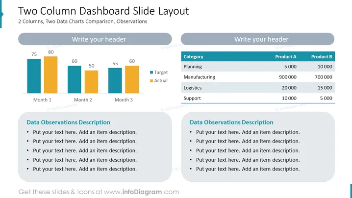
The slide titled "Two Column Dashboard Slide Layout" presents a comparison between two data charts over three months for target versus actual figures, accompanied by two sections for data observations description. These sections allow the presenter to include detailed explanations or insights about the data presented. The topic implies a focus on performance measurement, with the ability to customize the header and add specific observations relevant to the data.
The overall look of the slide is clean and corporate, with a neutral color scheme that allows for clear presentation of data. The use of icons is minimal, with more emphasis on the graphs, charts, and text sections.


